
Hospital Records has blissfully pumped 30 years of unadulterated fun into drum & bass.
From London Elektricity’s Billion Dollar Gravy and High Contrast’s High Society to Logistics’ Now More Than Ever. Danny Byrd’s Supersized. Camo & Krooked’s Cross The Line. We have been totally and utterly blessed with thirty years of bouncy, liquid anthems and funk-filled-future classics.
But it was never just about the music. The visual characteristics of the brand, the energy of the artwork, the attention to the finest of details, the message of togetherness they send rippling across the scene; it has all played a role in creating and solidifying the Hospital Records we all know and love today.
Since the start of Hospital Records in 1996, the label’s artwork has been clever, colourful, mischievous, occasionally completely unnecessary, and yet, all very much: Hospital.
Prescription stickers printed on a machine held together by a toilet roll holder. Playmobil surgery. Spray-painted leaves. Homemade LED contraptions. Actual chocolate bars. Actual golden tickets.
For its 30th birthday, we went digging back through the archives with Chris Goss and Hospital’s long-standing in-house graphic designer/artist, Ricky Trickartt, to find out how some of those iconic sleeves came to life.
Chris! When you think back to the beginning, how important was having a visual identity alongside a musical one?
Chris: It was massive. I’d been to art college and I met Tony as a designer. In the early ’90s I was working in a record shop in Soho a couple of days a week, but I was also doing little bits of artwork. I used to design those tiny black and white adverts that ran down the side of the music listings in Time Out. Trust me, it wasn’t thrilling! You had to squeeze all this stuff into no space whatsoever, so it was more like typesetting. But I love typography. Me and Ricky both love typography.
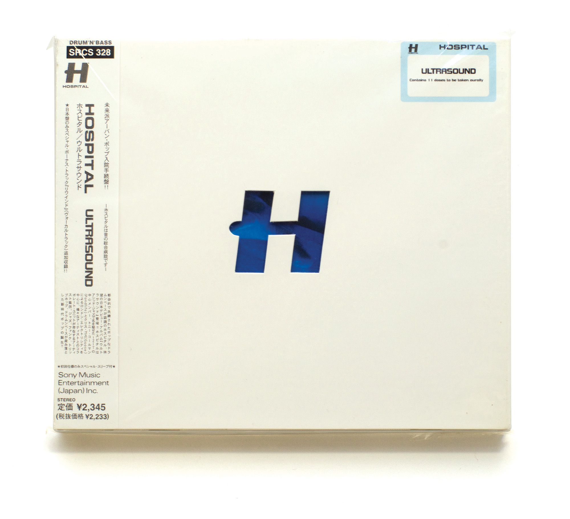
I met Tony through doing that, designed a couple of record sleeves for him and, to be honest, I didn’t know what I was doing. But I’d been buying records since I was nine years old, so I was excited to have a go. He wasn’t the easiest client either because he’s quite stubborn – as am I. When we started Hospital, we both felt really strongly about the visuals. When we came up with the name Hospital, neither of us actually knows who said it first, but immediately we started thinking about everything we could do with it. You could do an album called Ultrasound. You could do an album called Plastic Surgery. You could do something with Outpatients. All of those things, we did.
The opportunities were endless! How did you land on the world famous Hospital Records ‘H’?
Chris: The logo was obvious – it was going to be an H because the international symbol for a hospital is an H. So, put an H in a circle. Bosh. I spent so long staring at Hs, though. The weird thing is the H I eventually chose comes from a really horrible font that I really don’t like! But it was slightly different. It was italic and had this funny little semi-circular knobble on the side. When I isolated it and put it in a circle I thought, ‘Oh, that’s really good.’ It had character. Once I’d chosen the H, the logo took about five minutes.
We didn’t have much money, so the early artwork also had to be cost-effective. We wanted something really special, but we couldn’t afford spot varnishes and all of that. I was working in record shops and doing graphic design, Tony was doing corporate video music – we were just doing whatever we could to pay the bills because we were really, really into doing this label.
At that point, a lot of drum & bass sleeves had this highly stylised, colourful, slightly sci-fi aesthetic. Me and Tony absolutely wanted something different. Our music was pretty leftfield too – very musical, quite exotic, lots of instruments. We basically thought, ‘We’re never going to make it in this world. People are going to hate it.’ So we thought: let’s lean in!
Ricky! How were you originally brought into the Hospital fold?
Ricky: When forums used to be a thing – social media before social media – I got really into Dogs On Acid when I was a teenager. I spent a lot of time on there and I think I eventually managed to get my foot in the door by upsetting Chris and telling him his artwork wasn’t good enough.
Chris: Absolutely! Ricky put up a thread about Nu:Tone’s Brave Nu World. He was quite distressed by my typesetting.
Ricky: For me, it was more that the picture was wonky! It needed to be straightened up.
Chris: Initially I was like, ‘Who the hell is this guy?’ Then I looked at it and thought, ‘Yeah, he’s got a point actually.’ Obviously I wouldn’t say that publicly. The thread went on for pages with people going, ‘Yeah Ricky, you’re right,’ and I think on about the fourth page I just went: ‘Hello.’
Ricky: Then suddenly I was like, ‘Oh sh*t. No, no, no – I really like all the work, you could’ve just done it a bit more accurately!’ We started talking from there. I began doing Flash web banners for Hospital and getting really silly with them. Then the first sleeve I did was London Elektricity’s Hanging Rock.
Chris: I have to admit, it took quite a lot for me. For the best part of ten years it had all been my artwork and I was proud of it. But I think deep down I knew we could benefit from some fresh adrenaline, ideas and talent.
My software skills were shockingly bad. I didn’t touch a computer until a year after leaving art college. Manuals bored the sh*t out of me. Tutorials – boring. I just wanted to do it. So as we got into 2005, 2006, 2007, it was painfully clear that it was time. I don’t mind admitting it was hard for me to let go. It didn’t happen overnight. We gradually started working together and bedded in over a couple of years. I like to call myself Art Director because it makes me feel important. I’m not often the nuts-and-bolts designer anymore, but I do have good ideas. I also have crap ideas.
Ricky: Sometimes I’ll visualise them just to prove to him that they’re crap.
Humour and playfulness run through so much of Hospital’s artwork. Was that partly about going against the very serious D&B aesthetic?
Chris: We absolutely wanted something that didn’t look like all the other drum & bass labels. Things can be overly serious in music. We want people to use their brains and have another look at something and go, ‘Oh right! I get it.’
Ricky: It got very silly at times. I ended up being an accidental copywriter at Hospital. Sometimes I’ll do something and need a bit of text to fill a gap. Nobody raises their hand to write it, so I’ll just write something silly there to amuse myself and then it ends up staying in.
Chris: Even the old prescription labels had stupid little things written on them – ‘keep out of reach of adults’, ‘strictly for medical porpoises’. We were putting these stupid little taglines on there because they amused us. But we were also trying to give some additional character to who we were and what the label felt like. It was really important that we were in our own lane. I didn’t want people to think we were just seeing what somebody else was doing and going, ‘That’s cool, I’ll do a version of that.’ No. We’re going to patiently set out our own lane and try to make it work.
THE ORIGINAL HOUSEBAGS
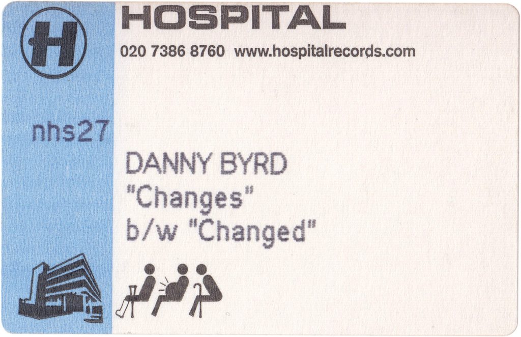
Chris: We wanted a housebag we could use repeatedly for the 12-inches. The first thought was: rather than having the standard circular hole in the middle, why don’t we cut out the actual H? Nobody was doing that. I contacted the sleeve printers and asked if it was going to be really expensive. They said, “No, you just need to make a cutter.” I think it cost about £90. Then we thought, why don’t we have nothing printed on the sleeve at all? That’s cheap as chips. But obviously you need the information somewhere, and lots of records at the time would have a sticker in the top corner with the artist and title. So I thought: let’s do a sticker, but make it the kind of label you get at a chemist when you have a prescription. I found this company in Middlesex that basically only made stickers for chemists. The bloke genuinely thought we were a hospital. Eventually I gave up arguing and went, ‘Yes. We’re a hospital. Fine. This is our address.’
Then came actually printing them. I had to buy an ancient Apple ImageWriter with the sprockets on it and feed the labels through. It was like something from the 1950s. The funniest thing was that because it was basically this massive toilet roll of labels, I bought a toilet-roll holder and screwed it to the stationery cupboard wall. Printing them was a nightmare. You’d press print and it would print half on the label, half on the roll. One label probably took a couple of minutes.
When you’ve got to print 5,000, that’s insane.
Somehow we got these stickers done and they looked amazing. Really authentic. You put that prescription label on a plain white sleeve with the H cut out and those records didn’t look like anything else. I was really proud of it.
Ricky: It later became the classic intern job.
Chris: People hated that job!
Those sleeves became part of the visual identity of Hospital for probably the first ten years. We’ve revived them every now and then too.
HOSPITAL RECORDS x JAPAN
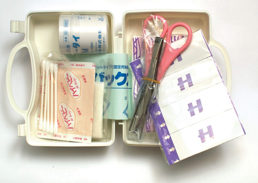
Chris: Hospital started in 1996 and we signed a deal with Sony in Japan in 1997. Sony started a label called Office One explicitly to release British drum & bass in Japan, which feels kind of nuts now. They released about five albums from Hospital, and for the first one they took us to a television studio on the outskirts of Tokyo. The studio was actually an old Japanese hospital that had been bought by the TV company and was used for the Japanese equivalent of Casualty.
We walked into this hospital set, there was stuff everywhere, they brought us costumes and we did this whole photoshoot. The packaging was incredible as well. The vinyl came in picture inner sleeves inside this heat-sealed plastic bag with a silver Hospital logo. To actually get the record out, you had to get a pair of scissors and slice through the top.
At a time when in England nobody would give us the time of day, in Japan they thought we were amazing. Japan has such an incredible visual heritage and such an appetite for art and culture. Sony and Office One were so enthusiastic about what we were doing. It really helped us believe in ourselves.
PLASTIC SURGERY
Chris: Plastic Surgery was one of the names we’d written down right at the beginning. Early on, this couple from Westcliff-on-Sea contacted us. They had a company called Medicus Maximus and basically bought and sold hospital ephemera. They said, ‘We really like you guys. We’ve got something you might like. You can have it, but you need to hire a van and come and get it.’
It was a Victorian child’s operating table.
We were like: yeah, we really want that.
It was a dead weight. It took about five people to lift it. Somehow we got it back to London and into the basement studio. Then we used to put our record decks on it. So it became our DJ booth.
Ricky: Plastic Surgery 2 and 3 really defined what I thought was brilliant about Hospital before I worked here. It wasn’t about what had been done on a computer. It was about the object.
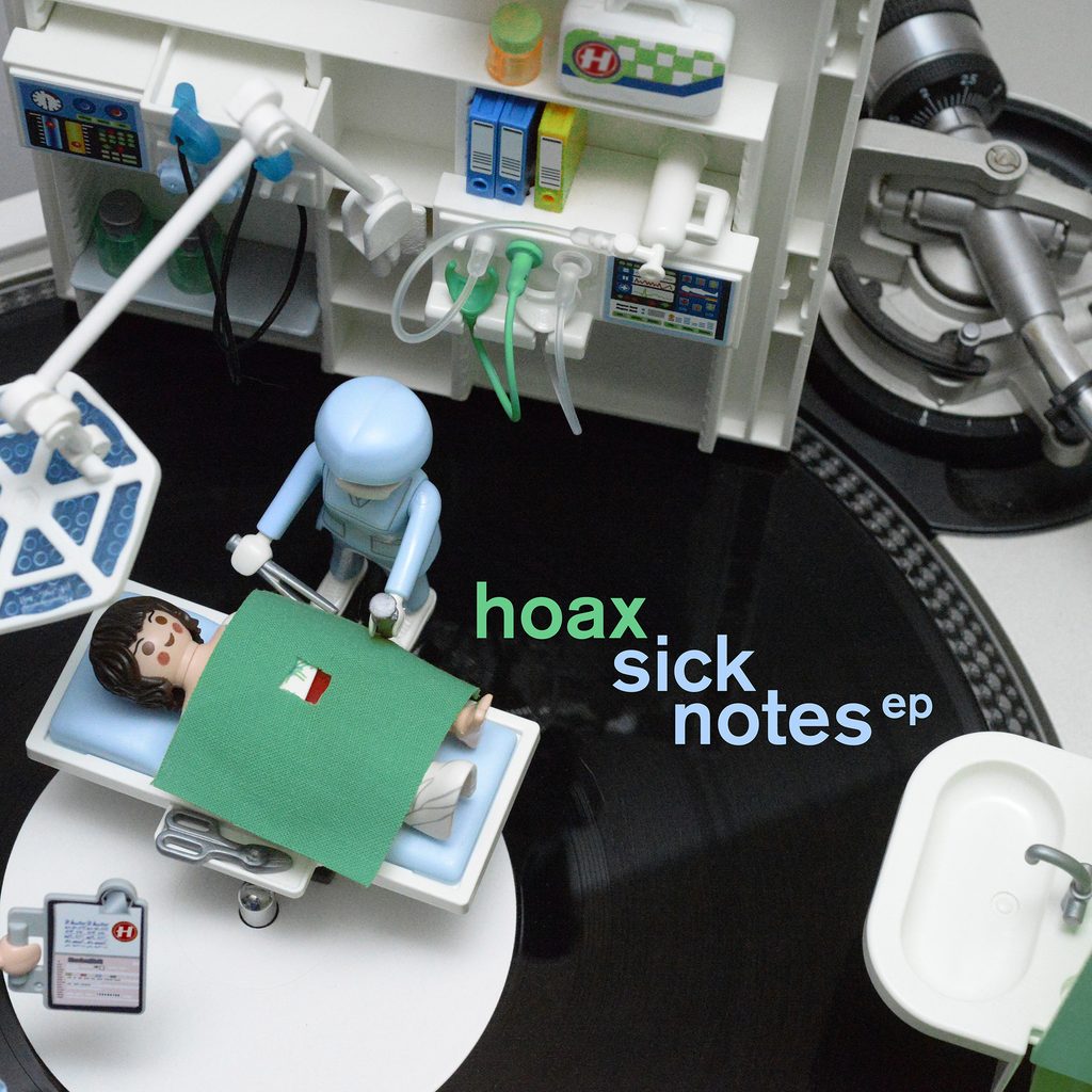
Chris: For Plastic Surgery 3, we used Playmobil doctors and patients that we’d bought on our first DJ trip to Tokyo in ’98. We just arranged them on the mixing desk because we thought it was funny. That became quite an iconic image. It represented the environment and feel of the label – not taking ourselves too seriously. We even came back to that idea years later with Hoax because he specifically said, ‘I really want a classic Hospital cover.’
WEAPONS OF MASS CREATION
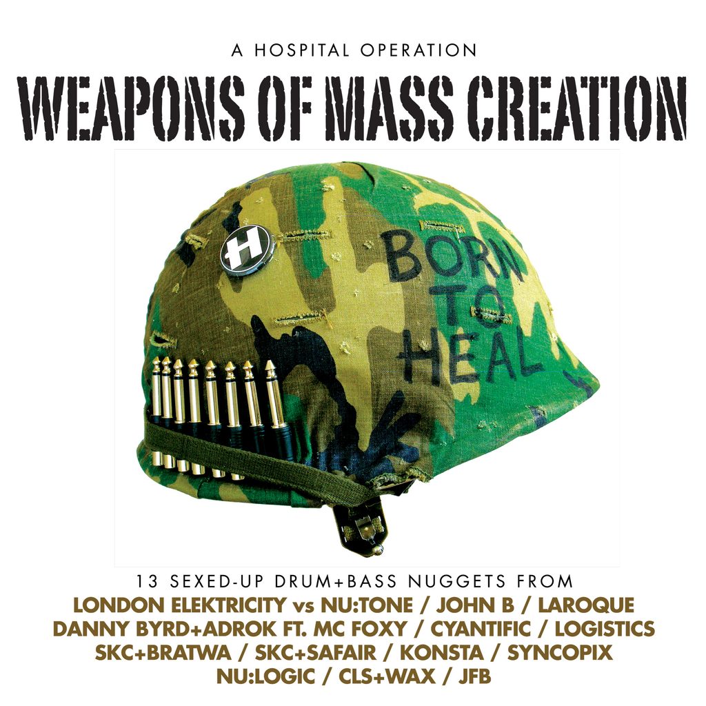
Chris: Weapons Of Mass Creation was Tony’s title. It was obviously a play on what was happening politically at the time with the Iraq War and ‘weapons of mass destruction’.
Volume One was basically my plagiarism of Full Metal Jacket. I went to this huge military surplus shop on Euston Road because I knew exactly what I wanted. I bought an American GI helmet and recreated the idea using headphone jacks instead of bullets. It said ‘Born To Heal’ instead of ‘Born To Kill’ and had a Hospital badge. I did all that, took a picture in the office and thought: that is wicked. Showed Tony. He went: ‘Yeah, I don’t like it.’ I was like, “Well, this is the cover. So we can argue about it, but this is it.’
For me, it ticks all the boxes. There’s medical stuff, there’s a pun on what’s happening around us and there’s a reference to another creative cultural touchstone. Later Tony completely adopted it. We did T-shirts and everything. Then with Volume Two we had the theme, so I thought about those little Tamiya military model kits I loved as a kid. If you actually look closely at those soldiers, though, somebody is carrying a Juno-106, someone is making a tune on a laptop, somebody’s going through records and dubplates. It isn’t meant to be super serious.
Ricky: Then by Volume Three, Chris showed me that classic Stars and Stripes V-sign patch and said, ‘I want that, but with three fingers.’
I started mocking it up on the computer and eventually thought, this would be better if we just made the thing. So we got about 500 patches manufactured. I bought an army surplus shirt and was literally sitting there hand-stitching the patch onto it while the photographer was waiting to take the picture.
LOGISTICS – NOW MORE THAN EVER
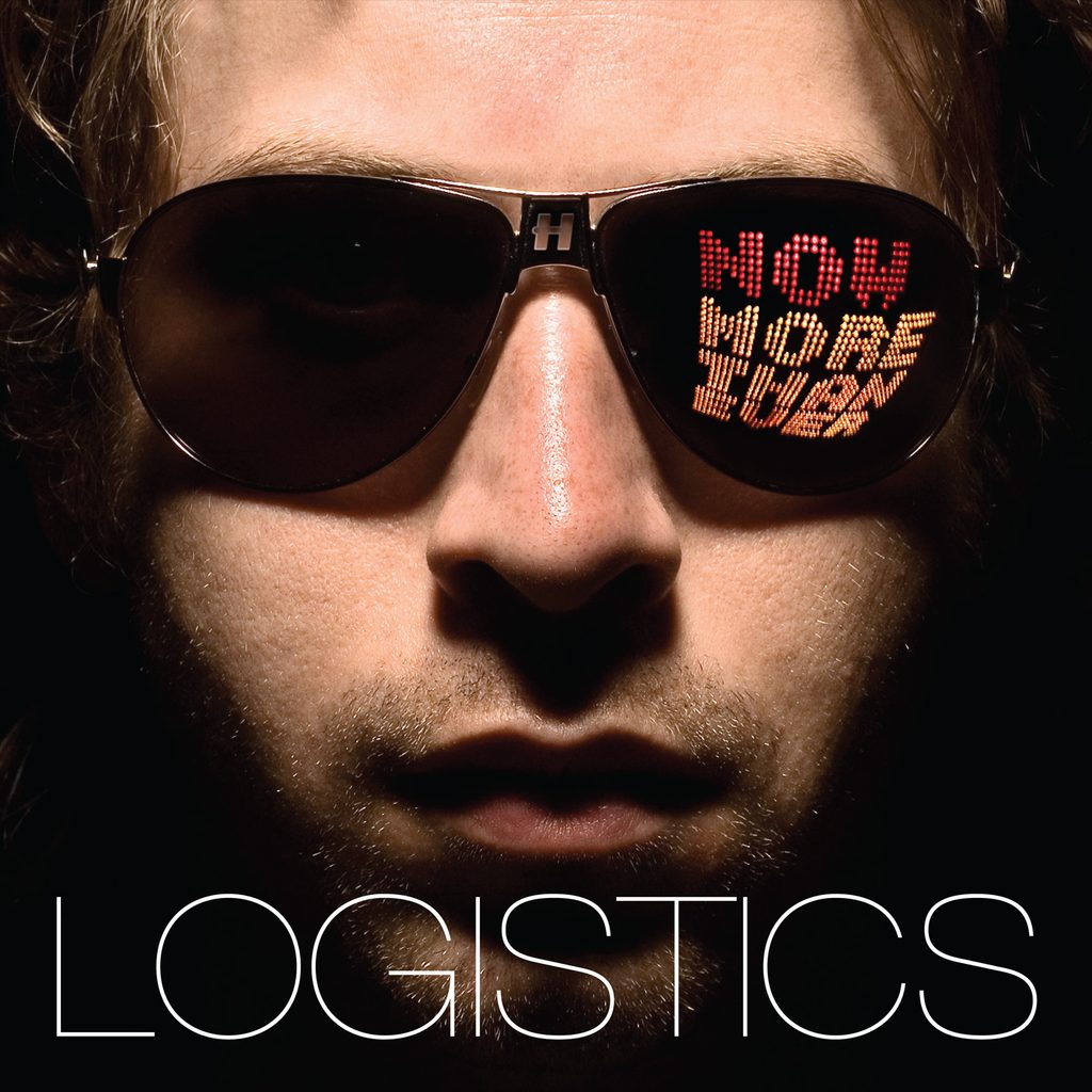
Ricky: This is one of those times when Chris treats me like one of those wind-up cymbal monkeys. He gives me something and goes, ‘There you go.’ There was an image in an old design book – just an alphabet made out of dots – and Chris was basically like, ‘Something like this.’ So I looked at it and thought: well, let’s actually do that. I went to Maplin, bought a load of LEDs and asked my grandpa, who was an electrical engineer, how to make it work. I soldered it all together and made an actual light. Then I had to take this light on the back of my Vespa to the photoshoot in Brixton, where we physically held it up to Logistics’ face and reflected it in a pair of sunglasses that belonged to my brother.
One of my mottos in design is: You can’t get more real than reality. The funny thing was that some American creative website picked it up and people were commenting, ‘I could have done that in five minutes on my computer.’ And I was like: but this is actually real. That is literally how the light reflected in those glasses. It wasn’t superimposed.
Chris: I’ve still got the handmade light in the office. It’s iconic. It’s amazing.
REVERBERATION BOX
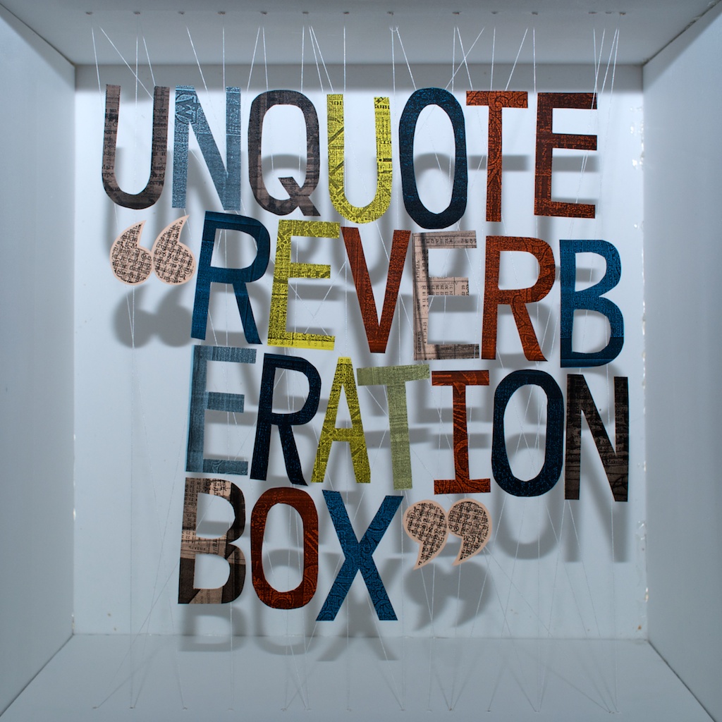
Ricky: This one is me indulging myself because it’s probably my favourite cover I’ve ever made. My grandpa gave me this completely knackered photocopier and said, ‘This barely works anymore, but I’m sure you’ll do something interesting with it.’ I started using it for the first couple of Unquote singles and it created this old USSR/Russian sort of artwork. Then it came to the album and everyone said, ‘Yeah, it’s not really enough. It needs to be something more.’ I was like, ‘Really? I liked it.’ So I made a wooden box and started stringing fishing wire through it, with all these individually cut-out pieces of paper suspended inside. I carefully balanced everything so I could photograph it. The back cover was made using this old photocopier and a ridiculous old typewriter my partner had bought called The Princess Matic. It turned out perfectly.
Chris: What I love about that one is that Unquote was a very underground artist, almost totally unknown. It’s important that we can deliver artwork that is unique, even for a relatively small release. At the same time we were working on Camo & Krooked’s debut album, which was obviously a completely different proposition commercially. But this artwork demonstrated that we actually give a sh*t. I don’t want to say we ‘take it seriously’, because part of the joy of Hospital is that we don’t. We value it. That’s the important difference.
Ricky: Do people know it was handmade? Probably not. Does it really matter? What matters to me is that I enjoyed making it.
DANNY BYRD – GOLDEN TICKET
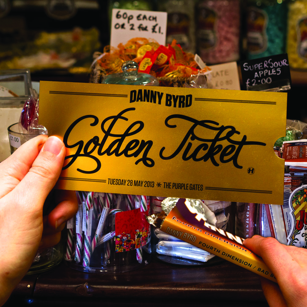
Ricky: The actual album cover became much more conservative than we originally planned. We tried all these fancy production finishes. We tried to get it foil blocked, then something broke with the foil blocker. We tried chocolate-brown vinyl and it came out streaky. It was just a really tough project, actually. But we did go: it is called Golden Ticket, so we’re doing this. I started making chocolate wrappers and wrapping them around chocolate bars.
Chris: We got a merchandise company to manufacture a run of actual chocolate bars and everyone who pre-ordered got one. Then we made five genuine golden tickets and hid them in the pre-orders. If you got one, there was an invitation to a party and a goodie bag and all of that. We also went into this old-fashioned sweet shop and photographed all their stock because I had this idea that every track title should become a different sweet wrapper. Ricky then had the painful job of painstakingly recreating all of them.
Ricky: The funny thing is the inner artwork ended up being much more fun than the actual album cover.
Chris: Danny’s always played along with us, which has been great. For his first album, Supersized, we took him to a model village because the obvious thing was: let’s make Danny supersized.
S.P.Y – BACK TO BASICS
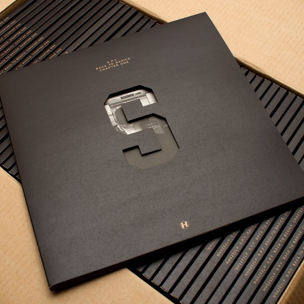
Chris: Carlos’ music at that point was very much a homage to that late-’90s sound. He was really perfecting that sound in his production, so we started thinking about studios, analogue equipment, mixing desks and all of that.
Ricky: Something I learnt pretty quickly working with Chris is: there’s usually a reference. He was sending me pictures of actual acetate records they’d had cut in the early days of the label and going, ‘Let’s do the label like this.’ So it feels like something that genuinely came from that period. We designed the CD to look like a CD-R that had just been written on with a marker pen. Then on the back of the record sleeve we recreated the stickers you’d get on acetate boxes before a vinyl record went into manufacturing. Whether people actually understood that specific reference doesn’t really matter. I think it gave the vibe. Even if you don’t recognise the source, it still has that feel.
Chris: It felt authentic and totally suitable for the sound of the record. And having the die-cut S was a nice throwback to the original Hospital housebags too.
ETHERWOOD – BLUE LEAVES
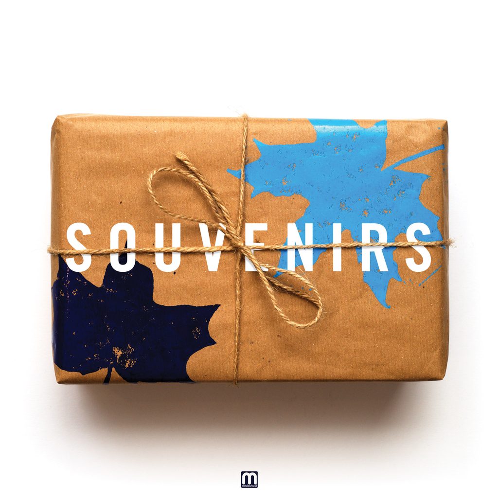
Ricky: Chris said Blue Leaves and I just took it literally. I thought: let’s get some leaves and make them blue. The first version was me getting loads of green leaves and changing them blue on the computer. Then I thought: no. Not right. So I collected actual leaves and literally spray-painted them blue. Those became elements we could use throughout all the singles as well, which was really fun.
Chris: What I particularly liked about this was that Woody had named the album before he’d finished it. For me and Ricky, that’s a gift. It meant we had time to develop it and, as an entire set – all the singles and the album – I’m really proud of it. It feels like a lovely series telling one story. Sometimes artists come up with an album title about a week before it comes out and you’re like: this is not how this shit works. Woody gave us Blue Leaves and it opened everything up.
LONDON ELEKTRICITY – ARE WE THERE YET?
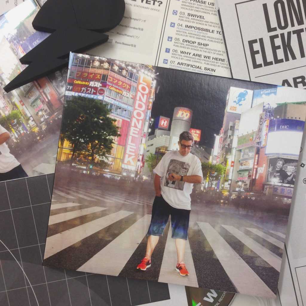
Chris: This is a good example of working with Tony. Sometimes he gets an idea and says, ‘Right, this is going to be my album cover.’ His wife is Japanese, he’d been going to Japan for years and he decided he wanted a photograph of himself looking at his watch on Shibuya Crossing. It’s this enormous crossing with people coming at you from every direction. So we were like: ‘Yeah, good luck with that, mate.’ He almost got arrested doing it. Japan is a very respectful, organised society and you’re not really meant to be standing there repeatedly doing photoshoots in the middle of Shibuya Crossing. He did it for about half an hour and got in trouble. But we got the image. The thing is, an image is only the starting point. You’ve then got a multipack vinyl, gatefold sleeve, inner sleeves, a CD booklet. Tony always wants everything possible to make the most special product. So the really good bit became expanding the idea.
The album is called Are We There Yet?, so it’s about a journey. I thought about those fold-out Ordnance Survey maps you used to take hiking. Then postcards. You send postcards while you’re travelling. The idea was good and Ricky just took it and ran with it. We had these beautiful almost Art Deco, 1930s sci-fi-style postcards and this lovely fold-out map. And, because it’s Tony: ‘I want a box. I want a custom-moulded USB key.’ So we did all of it.
FROZEN NERVES –
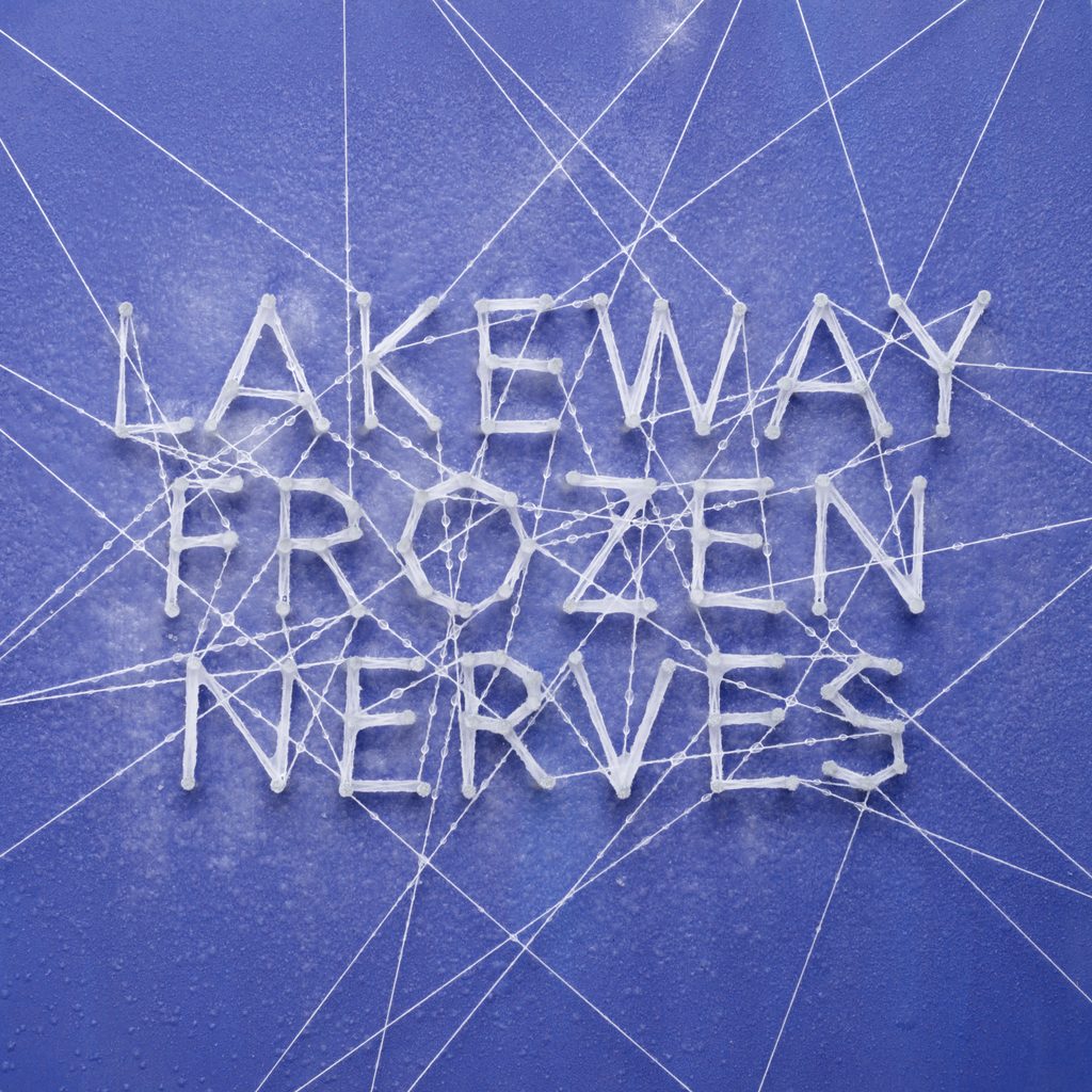
Ricky: This one is just really me being me. It was Med School, it was a little release, and I thought: ‘What would I do with this artwork?’ I’ll freeze it. So I made the artwork physically. I positioned nails into a board and ran string around them to spell the text. Then I put the entire board in my kitchen freezer. I’d spritz it with water, come back half an hour later, spritz it again and keep doing that until it actually froze. Is anybody going to notice that? Probably not!
Chris: I’ve still got the actual board in the office. We’ve got that and the handmade Now More Than Ever light. They’re iconic.
Ricky: I think I’ve still got some of the other props in my attic too.
NU:LOGIC – SOMEWHERE BETWEEN THE LIGHT
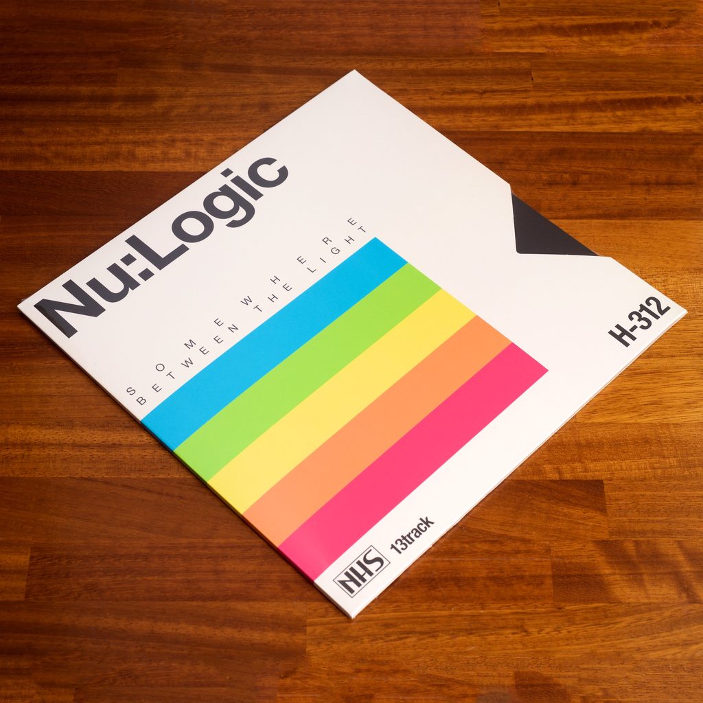
Chris: Dan and Matt are family. They’ve been with us for God knows – 25 years, maybe. They come from an incredibly creative family. Their late father was an amazing printmaker. You go to the family home and there’s beautiful framed artwork everywhere. They have specific taste, but they’re not always particularly demonstrative about what they want for their records. They’re a good example of artists who’ll say, ‘Well, what do you think?’ For some reason, I’d been staring at VHS tapes – all the different cassette types and their packaging. So I pitched that to Ricky and he ran with it.
Ricky: Unusually for me, it was entirely done on the computer, but it became really rewarding through all the production details. We did a die-cut on the side of the record sleeve that matched the original VHS packaging we were referencing. Then we did the CD in an opaque black jewel case, so it felt like an old VHS tape.
Chris: To me and Ricky, we love that stuff. You pull the case out and it’s just thick, plain black. Nothing else. That’s the visual joke. We’re recreating the feeling of a classic VHS tape. A lot of people probably just went, ‘Oh.’ And we were going: ‘Yeah! Yeah! Yeah! Yeah!’
NHS500
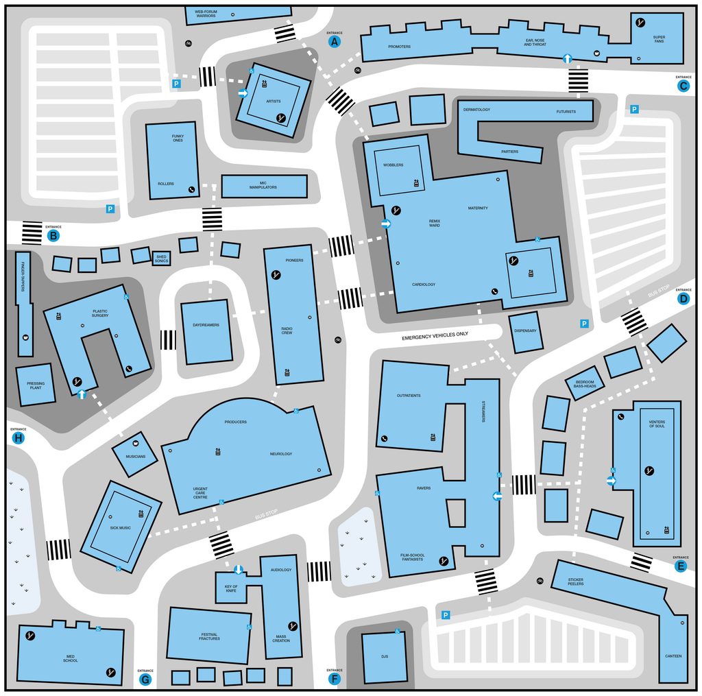
Ricky: This cover goes back to Chris’ time in Japan. There was an old flyer they’d designed over there that Chris really loved, so I painstakingly redrew that entire illustration for the cover. But for me, the really good bit is inside. I’d broken my foot around that time and had been spending loads of time going in and out of hospital. So I kept looking at all those hospital department maps. I created one for the artwork where all the department names reference little bits from Hospital’s history – artists, things from the label, little in-jokes.
Chris: The map was then essentially cut into four. When you pull the four records out and put all the sleeves next to one another on a table, you see the entire hospital map. Those are the details we enjoy. It’s that extra bit of storytelling. Even the copy is important. It’s all about giving the label character. Compilations have been fundamental to Hospital over the years – Plastic Surgery, Weapons Of Mass Creation, Sick Music. As they’ve got bigger and become these 20, 25, 30-track projects, visually they’ve become an opportunity for us to remind people what the culture of the company actually is.
Ricky: The devil’s in the details. That’s where you can have a lot of the fun.
THE NEON MIXTAPES
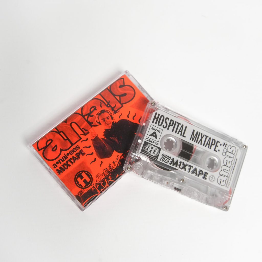
Ricky: We were told we were doing this cassette for Lens and I think she sent over a Pinterest moodboard where everything was this neon green. And I thought: Oh God. This is the worst thing ever. Because it’s the one colour you can’t print properly. It looks brilliant on screens, but when you try to print it, it just comes out like sludge. So I went on this long journey phoning people, ordering samples from every website I could find, trying to find neon paper stock that was actually the right colour. Eventually I found a supplier. The price was just about acceptable.
Lens is from the new-gen, so I thought: I’ll do something that feels like the artwork the kids are doing. Then we did another one a year later and I realised the neon paper was what had made the project special, so we did neon orange. With Anaïs, I’d never actually spoken to her and I suddenly realised I didn’t know how to pronounce her name. So I messaged her on Instagram and said, ‘Hi, I’m doing your artwork. How do you actually say your name?’ She sent me a voice note saying it. And I thought: brilliant. I’m putting the pronunciation on the cover too.
If you laid 30 years of Hospital artwork out in front of you without hearing any of the music, what story do you think it would tell?
Chris: I hope it describes the journey we’ve been on, which has gone in all sorts of different directions. Visually, the first seven to ten years are relatively focused. It’s a small emerging team of creative people, all roughly on the same page. Then gradually it starts spreading out. By the end, maybe it becomes relatively chaotic. But within that chaos, I hope there’s still a thread. Sometimes visual, sometimes thematic, but ultimately some kind of feeling that describes the label, the company and the people – how Hospital feels to us.
It’s important for the two of us to steer the ship visually as best we can. We work with freelancers, illustrators and photographers, but ultimately these are Hospital releases. I never want it to feel dry and detached. No matter what, it’s really important that it feels like it has personality.
Ricky: One of my beliefs is: The personality is in the imperfections.
If everything is too clinical – ironic word for Hospital – too clean and too precise, you end up without that personality. I’d rather have a record sleeve with some stupid error that makes it feel human. Or something I photographed where I couldn’t quite get the framing perfectly right. As a fan of Hospital before I worked here, I always felt it was obvious that the important thing is the idea behind the music, not the execution of it. Execution can be polished up by somebody who knows how. The idea is the hard part.